

Hall of Fame Memorabilia website is a sports ecommerce website


Journey with me as we look through my first eCommerce experience
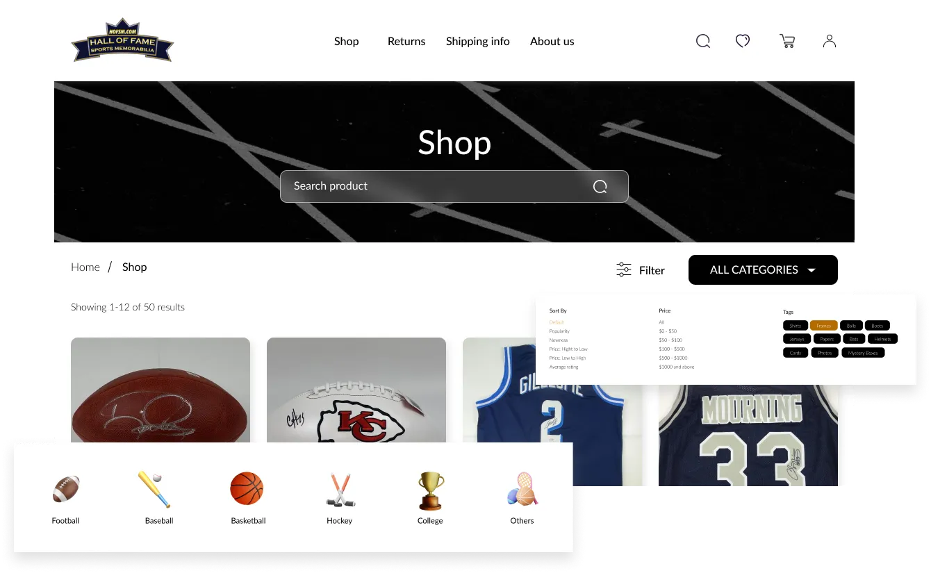
One major highlight of the design process is noticing how difficult it was to navigate the old website and in terms of usability. There’s a need for a way to allow users to create an account, log in, or checkout as a guest when they purchase products. The website had to include a listing of all products and offer a streamlined user experience.
Even with the time constraint to deliver the project, I was able to make some research to see what was going on in the memorabilia industry.
Here are the questions I asked myself and also, threw to the company's marketing team.


HOFSM feels a need to improve sales and believes the website -the major means of connecting to clients- doesn't have a great user experience.

HOFSM is a company that claims to sell original memorabilia, I asked if there was any means of confirming that.

Of course, the answer to getting testimonials from clients was a YES!


Found out some memorabilia websites but truth be told, most as well as old as at the time of research.
I wondered my most memorabilia websites look old and my answer is, maybe because they sell old things and their clients would always be there.
My only method here is to find a way to be better than the old experience.
The old website screenshot above shows that users have a lot to deal with on the homepage. The page was flat out and there was no shopping excitement.
My first step was to separate the homepage from the shopping page. Clients get to shop or search from homepage but the primary focus of the homepage will be to inform and excite them about the prospect of shopping at HOFSM.

Creating my first ecommerce design appeared to be a tough one. Some interesting constraints but was able to capture some design moments.
Users had a hard time navigating through memorabilia categories. The sales pitch were indifferentiable from other writings in the website

A new landing page to showcase important information and also, proof of authenticity. Super important for the business

Some users are always skeptical of uploading their information on websites, why not try to earn their trust by making guest checkout available to them? I did it.

I requested creating new images of the memorabilia with white backgrounds to better present them.
The request was rejected due to budgetary reasons.
Studios are not left out in this design too. Managers would like to keep track of their schedule and also receive physical payment from clients.
Despite the time, I did the little research I could,and designed a streamlined and exquisite experience for the company
As reported by the CEO, the new website skyrocketed its return in a year. Customer satisfaction was top-notch. All around, it was a beautiful experience.
Looking at my design now. I feel I would do better with the UI, I was gunning for a classic and old look, and I have a bunch of ideas to make it work now.
%201.webp)


